Blog
Finding a Way Home
Building up a community at Mary’s Place
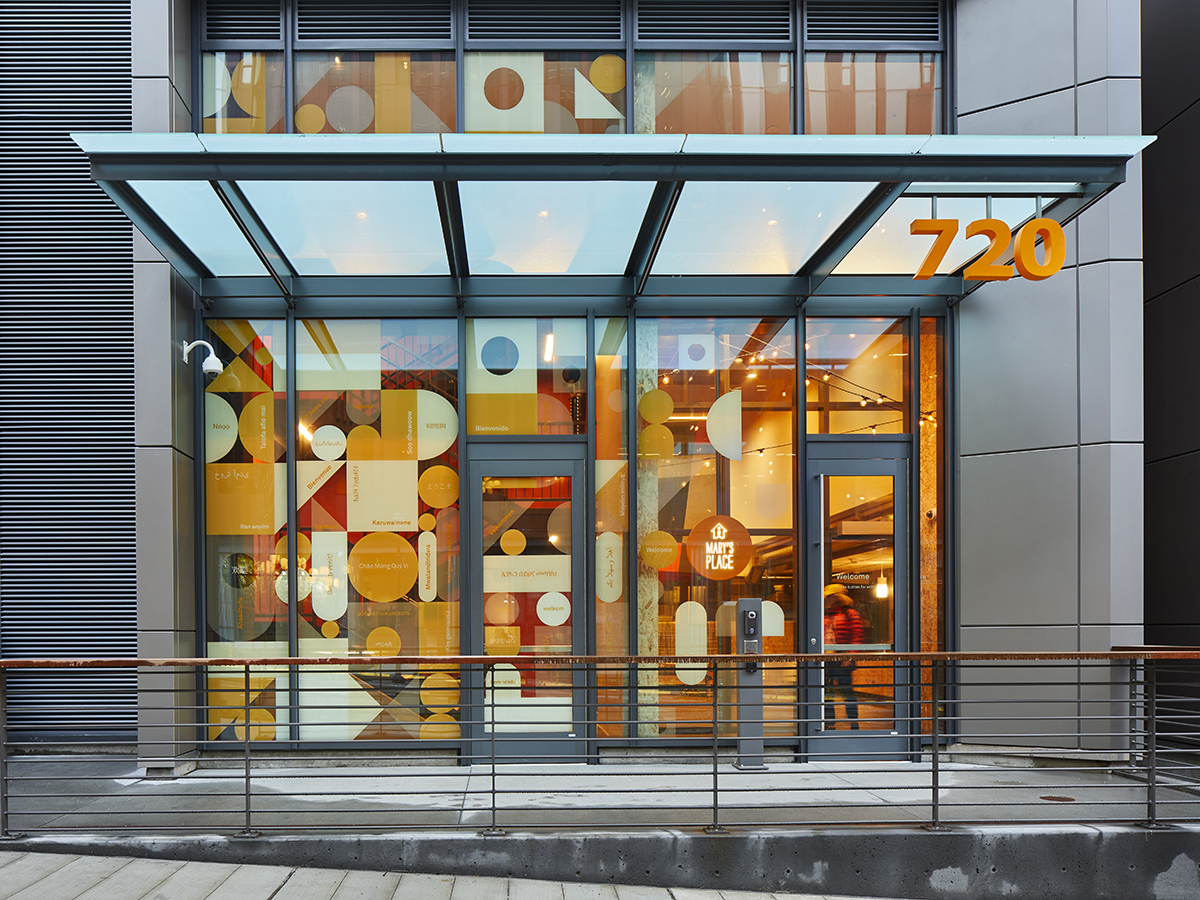
Mary’s Place employees, volunteers, visitors, and residents are greeted by the word “welcome” in more than 30 languages, representing the community’s diversity.
Mary’s Place is a safe, inclusive shelter that provides support and services to women, children, and families on their journey out of homelessness. Their new Seattle shelter needed a fresh and inspiring wayfinding system to reinforce its commitment to security and inclusion. How do you design such a system that builds up a community defined by connection, dreams, and hope? That facilitates working together and supporting one another? This is what we set out to design.
First, we decided on building blocks as the foundation for our design language, consisting of geometric shapes similar to a children’s building block set. These building blocks represent a collection of elements coming together—or working together, a core value of Mary’s Place—and the steps for moving out of homelessness. Their youthfulness directly reflects the children and young people whom Mary’s Place supports.
 Each of the facility’s eight floors has a name, color, themed graphic, and set of icons to make finding amenities and “neighborhoods” easy.
As a concept, Building Blocks certainly references the children at Mary’s Place, but our intent was for it to also reflect the ideas of growth, strength, foundation, aspiration and creativity – all words that describe the individuals who live and work there - Christina Sakura, Senior Designer
The entrance graphic pattern contains the word “welcome” in over 30 languages, specifically selected to reflect the diversity of Mary’s Place guests. Throughout the interior of the space, bright colors and eclectic furniture help create an approachable, cheerful, and homey environment that allows visitors and residents to relax and create a space of their own.
 A universal icon system helps all residents—regardless of age or primary language— navigate the facility and find what they need.
To make the facility’s eight floors feel more manageable to navigate, we gave each a unique color, themed graphic, and set of icons to help residents find resources and return to their “neighborhood.” A universal icon system makes it easy for residents of all ages and languages to identify and find the amenities they need. Playful ground graphics also support wayfinding throughout the facility.
Throughout Mary’s Place, we also subtly infused the building block themes of grow, climb, and soar: For example, in the community room one graphic features leaves representing “growth”, another a mountain with trees representing “climb”, and one with birds representing “soar”.
 Like the turquoise used here, bright colors bring a cheerful optimism and welcome to the spaces and services within Mary’s Place.
On the eighth floor, we further brought a sense of community to life with an art installation that showcases a world map with an eye bolt pattern covering each continent. Each new guest is encouraged to tie a thread on the map to identify their hometown—a symbolic gesture of each becoming a part of the community fabric at Mary’s Place. With each new thread, the community sees, in real-time, how it’s growing and building up, supported by each other, volunteers, workers, and neighbors.
 True to its commitment to its community, Mary’s Place celebrates its many donors with a “welcome home” wall.
Photos by Benjamin Benschneider
Published on 21 January 2021